Brand Guidelines
This is how inCube Social looks, sounds, and feels.
A public reference for press, partners, and prospects — the marks, colors, type, and voice that make up our brand, and the rules that keep it consistent everywhere it shows up.
01 — Logo & Wordmark
The wordmark
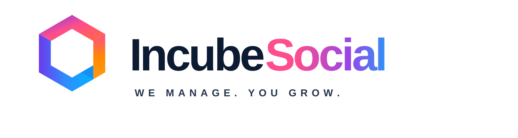
inCube Social doesn’t yet have a standalone logo graphic — our mark today is a typographic wordmark: Sora, Extra Bold (800), filled with the signature gradient. This is the exact treatment used in our site header, and it is the only correct way to render our name as a mark.
Do
- Keep clear space around the wordmark equal to the height of the capital “S” on every side.
- Use the full gradient fill (pink → purple → blue) whenever color reproduction allows.
- Set a minimum rendered height of 20px (digital) or 0.3in (print) so the wordmark stays legible.
- On dark navy or busy photo backgrounds, confirm the gradient still reads clearly — add a subtle scrim behind it if not.
- When color reproduction isn’t possible (e.g. one-color fax, engraving), use solid Dark Navy or solid white — never grey.
Don’t
- Don’t recolor the wordmark to a brand-off color, or apply the gradient to anything other than the name itself.
- Don’t stretch, skew, condense, or otherwise distort the type — scale proportionally only.
- Don’t change the typeface, weight, or letter-spacing.
- Don’t place the wordmark on a busy image or pattern without a scrim — legibility always wins.
- Don’t add drop shadows, outlines, or effects not shown above.
02 — Color Palette
Six colors, one system
Two foundation colors carry the brand’s trust and simplicity. Four accent colors — used individually or together as the signature gradient — carry its creativity and energy.
Dark Navy
Foundation#0D132B
Trust. Our body copy, headlines, and dark surfaces anchor the brand in something stable and dependable.
Light Grey
Foundation#F2F4F7
Simplicity. Our default page background — quiet, uncluttered, never competing with content.
Purple
Primary#6C3AED
Intelligence & creativity. Our primary brand color — links, primary actions, and the purple heart at the center of the signature gradient.
Pink
Accent#FF4D8D
Creativity & expression. The warm opening note of the signature gradient, and our accent for emphasis.
Orange
Accent#FF8A00
Energy & momentum. A small, hot accent for badges and highlights — used on its own, never in the signature gradient, and never a dominant surface color.
Blue
Accent#00B4FF
Intelligence & clarity. Closes out the signature gradient on a cool, clear note.
Signature Gradient
Accent-only#FF4D8D → #9A45E8 → #00B4FF
Pink to purple to blue, left to right — taken straight from the “Social” in our wordmark. Our full brand story in one sweep, used for the mark, hero moments, and primary calls to action.
03 — Typography
Sora for headlines, Inter for reading
Two typefaces, two jobs. Sora carries personality in headlines and short bursts of emphasis; Inter stays quiet and highly legible everywhere someone is actually reading.
Sora — Headings
Google Fonts · enqueued sitewideGet Your Mondays Back
Aa Bb Cc — Bold 700
Aa Bb Cc — SemiBold 600
Aa Bb Cc — Regular 400
Inter — Body
Google Fonts · enqueued sitewideYou run your business. We manage your social media.
Inter is set for reading, not shouting — every paragraph on incubesocial.com, every onboarding-form label, every portal notification uses this typeface at comfortable line-height so clients can move through real information quickly.
04 — Voice & Tone
How inCube Social sounds
Our core message drives everything we write: “Get Your Mondays Back. You run your business. We manage your social media.” Every trait below exists to make that promise feel real, not just printable.
Modern
We sound like today, not like a 2014 marketing deck. Plain language, current references, no jargon for jargon’s sake.
Energetic
Short sentences. Active verbs. We write like we’re excited about the work, because we are.
Intelligent
We know social media and we show it through specifics, not buzzwords. Confidence without condescension.
Approachable
A business owner should feel like they’re talking to a smart friend who happens to run their social media, not a call center.
Creative
We’re a content company — our own copy should never read like it was written by committee.
Dependable
We say what we’ll do and we do it. No overpromising, no vague guarantees, no fine-print surprises.
We are
Modern, energetic, intelligent, approachable, creative, dependable — a real team a business owner would want to grab coffee with.
We are not
A generic AI-startup with a dark, neon aesthetic and robotic copy — and not a distant, expensive agency that talks over its clients’ heads.
In practice
“We write like we’re talking to a smart business owner, not an ad agency pitching them.”
“Your first content calendar is ready Thursday. Take a look and tell us what’s working — that’s it.”
“Leverage our proprietary content ecosystem to synergize your brand’s digital footprint across omnichannel touchpoints.”
05 — The One Hard Rule
The gradient is a spotlight, not a floodlight.
The signature gradient is reserved for the wordmark, hero moments, and primary calls to action — never a full-page or full-section background flood. It works because it’s rare. Everywhere else, the brand runs on Dark Navy, Light Grey, and single accent colors used deliberately.
- ✓ The wordmark / logo mark
- ✓ One hero moment per page
- ✓ Primary buttons & CTAs
- ✕ Full-page or full-section background fills
- ✕ Body text or large blocks of copy
- ✕ More than one gradient element competing on screen at once